Categories
News

New Sign Designed & Built In-House

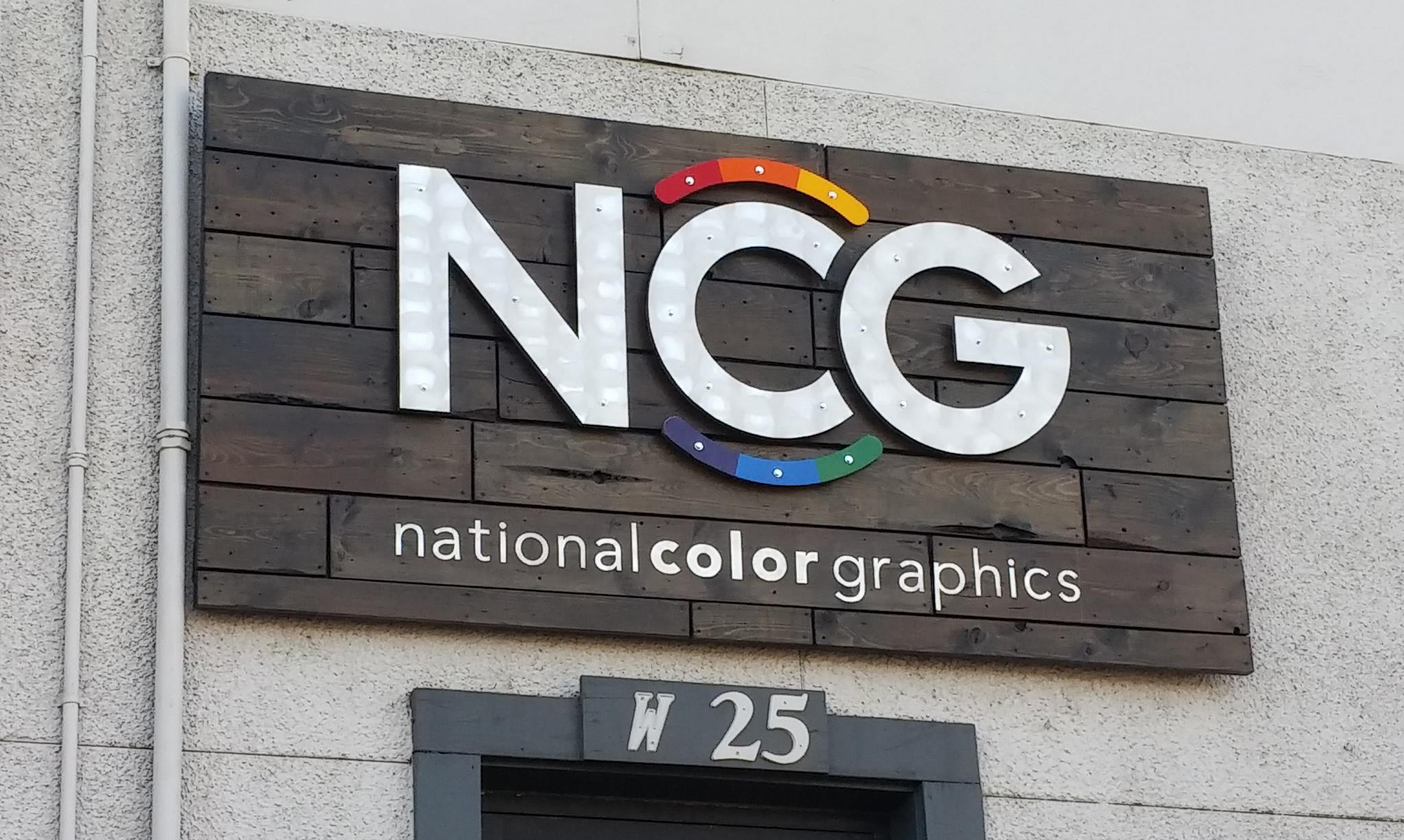
New Sign Solidifies Brand Refresh

A very important component to the Brand Refresh was our new sign, designed and built by NCG’s very own Aaron Harris and Kraig Kochel. The sign was made using mostly recycled materials and Low-VOC finishes to continue our commitment to the environment.

ncg-logo-sign-3d-mockup

First the sign was designed in a 3D program, SketchUp.

NCG Sign Small Letters

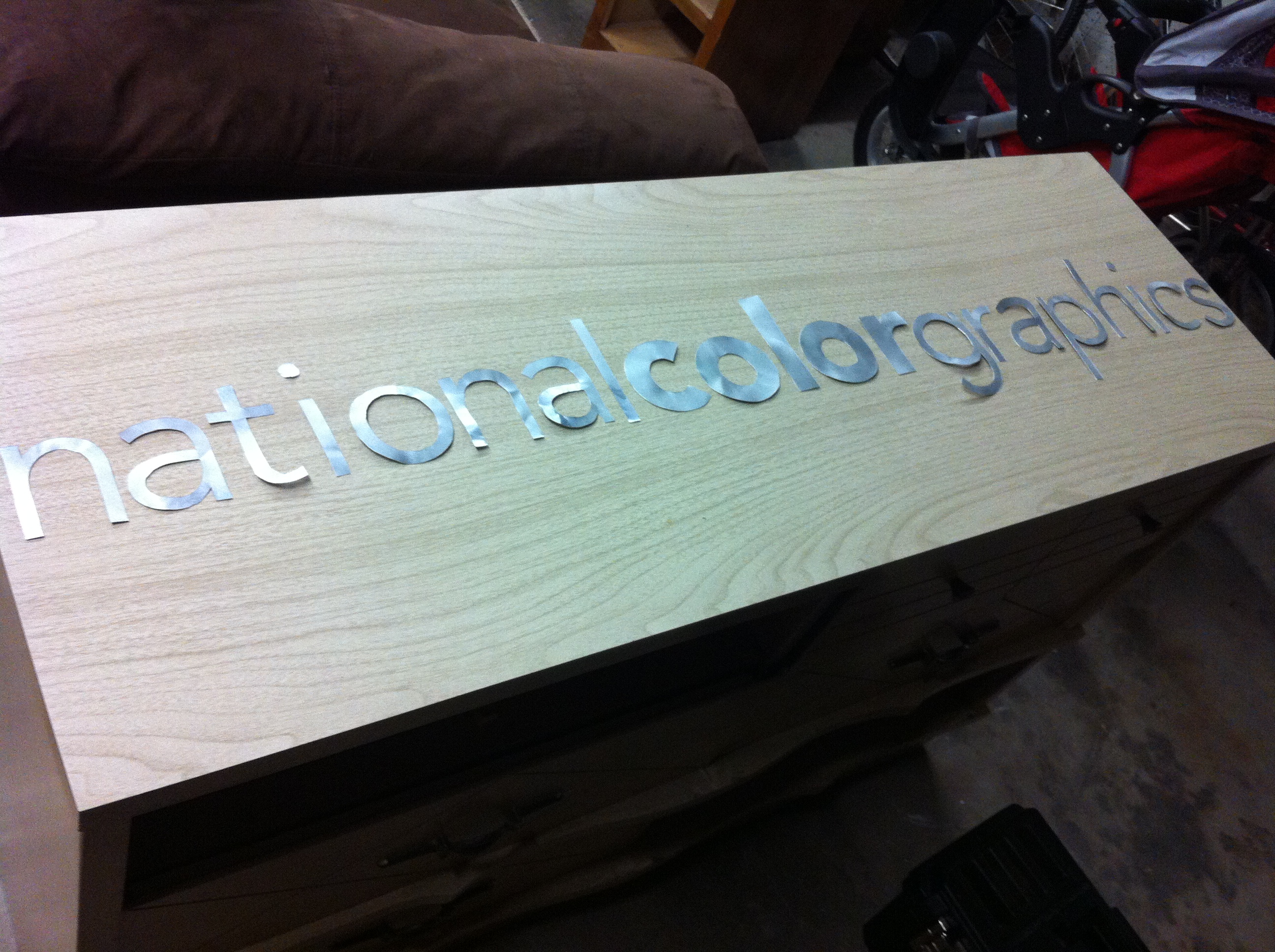
Once materials were gathered and purchased, Kraig scuffed up the recycled metal printing plates, then trimmed out using a sharp utility blade. These letters were then the templates for Aaron to cut the letters out of plywood.

ncg-sign-cutouts

ncg-sign-pallet-boards

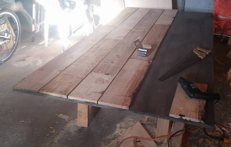
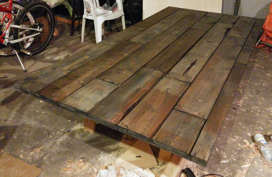
Recycled pallets were then broken down, and given a sealing coat of deck stain. Once dry, the pallet boards were attached to the plywood base and the entire wooden portion of the sign was given several coats of waterproof deck stain.

ncg-sign-backdrop

ncg-sign-letters

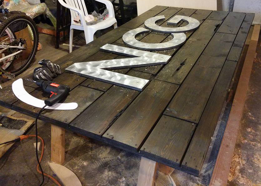
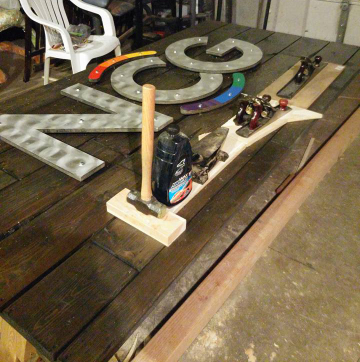
The metal letters and swooshes were painted and sealed with a waterproof clear coat then mounted to the board with 1 inch spacers to provide dimension and depth to the sign. The smaller letters were then glued to the sign.

ncg-sign-weights

14291737_1427359417280451_1047309331436059635_n

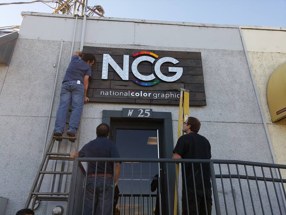
Once completely dry, the sign was brought over to National Color Graphics and hung where the old sign was located.
“Thanks Aaron and Kraig for a job well done. You Guys Rock!” Tom Shannon

Hanging the New Sign

Stay tuned as we continue the conversation about what’s goin’ down at NCG!
-Aaron Harris

Categories
News

Fresh New Look

 The New NCG Logo Revealed

After several weeks of great dialogue and constructive criticism, we’re excited to unveil the ‘new look’ for the NCG Brand Refresh.

This was a great experience and certainly exceeded our expectations. We were pleasantly surprised and humbled by your response and encouragement.

After receiving feedback and votes from our poll, we decided to combine the two most favorite logos. We chose to combine the color-wheel surround from logo number one the strong letter forms from the Google-esc logo number three. This keeps the logo readable, fun, and friendly while referencing our past.

We appreciate everyone who took the time to give us their perspectives and valued feedback. Thank you for being a part of the process.


Sampling of your feedback

Logo1

“We like #1, we like the way the colors wrap around the ‘C'”

“Hands down, #1. It’s clean and simple. Nothing funky. More corporate. All of which will allow you to keep it around.”

“Lovely!”

“Option 1 is my favorite for the way that it incorporates the color for printing, yet does not take away from the actual branding of the name.”

“Well done!”


Logo2

“I love the simulated paper aspect and how fresh it looks.”

“The boldness of the all color “NCG” was better than the dominantly black lettering.”

“This was a hard choice! I like the vibrancy and dimensionality
of option 2 the best, so that’s why I picked it.”

“I like design #2 if it is strictly used as a color print, but I don’t think it would look good printed in black.”

“I like 2 a lot. 2 is bright, bold, very modern. Lets color do the talking.”


Logo3

“A logo has to be legible and recognizable when reduced to thumbnail size. #3 does it.”

“This is the most easy to read and simplest design. Simple is ‘more’.”

“Good for you guys! I like #3 because of it’s simplicity and it’s retro leaning. It will likely be more timeless because of that.”

“I feel number three is the strongest. It is clean, crisp, readable and modern.”

“#3 looks the most professional, concise and confident.”


Logo4

“I like that the shapes look like ink drops, and the CMYK colors harken to your name and to printing. It’s cleaner and simpler than some of the others.”

“I like the simplicity of #4. Would like the color drops to be dimensional.”

“They all look great. Good job! I like the primary colors used in 4.”

“While it probably departs the most of all the options from original logos, it’s clean, has a “current” look, and I like how the CMYK ink blots are used.”

“I like the organic feel of the color drops above the ‘N.’ It is friendly and inviting and still has the feel of the company. Very well done!”


Logo5

“Option 5 read like ‘NOG’ to me, not ‘NCG’, since the color wheel fills in the counter on the ‘C’.”

“I like the C in #3, but like the font of #5, with #5 being my overall pick.”

“#5 looks too much like ‘NOG’.”

“I like the color wheel and the thin, classy font in this option :-)”


It’s Happening at NCG…

With our newly finished 10,000 square foot expansion, to our G7 Certification for color management and the addition of new talent to our already dynamic team, it’s been a good year.

With so many positive changes and enhancements over the past 12 months, we felt it was the perfect time for a little ‘Brand Refresh.’

So we started to brainstorm….

And we decided the best way to tackle this project would be to go to the experts; the marketing professionals, graphic design gurus and creative minds….and boy did YOU deliver!

The feedback was great and we quickly realized the power of engaging
with our partners and involving them in the process.

Old to new